
If you’re familiar with any of my other sites, you’ll probably recognize that this one has a very, very different look to it. Why is that?

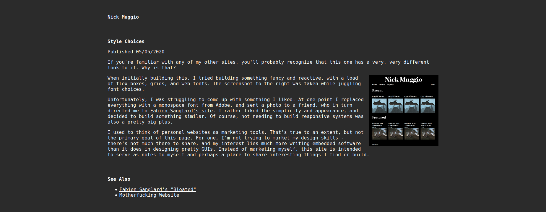
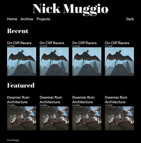
When initially building this, I tried building something fancy and reactive, with a load of flex boxes, grids, and web fonts. The screenshot to the right was taken while juggling font choices.
Unfortunately, I was struggling to come up with something I liked. At one point I replaced everything with a monospace font from Adobe, and sent a photo to a friend, who in turn directed me to Fabien Sanglard’s site. I rather liked the simplicity and appearance, and decided to build something similar. Of course, not needing to build responsive systems was also a pretty big plus.
I used to think of personal websites as marketing tools. That’s true to an extent, but not the primary goal of this page. For one, I’m not trying to market my design skills - there’s not much there to share, and my interest lies much more writing embedded software than it does in designing pretty GUIs. Instead of marketing myself, this site is intended to serve as notes to myself and perhaps a place to share interesting things I find or build.
Fabien
Sanglard’s “Bloated”
Motherfucking Website
Copyright 2025 Nick Muggio.
Last updated 2025-08-18T02:40:13+00:00. Rev e39184d.